Editing Our Opening Title Sequence
In the edit suite we started off by looking back over our footage from the shoot day, in total we had over 100 shots that we needed to condense into two minutes of film. Once we had filed through and looked at all the shots we found that a lot of them were blurry, or not as well executed as we had hoped so we got rid of those ones straight away.
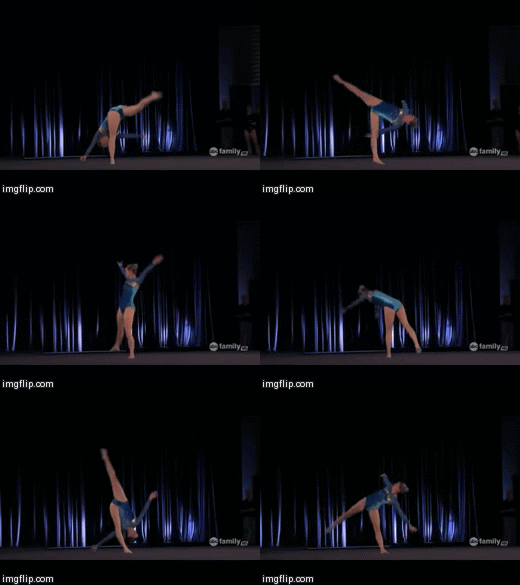
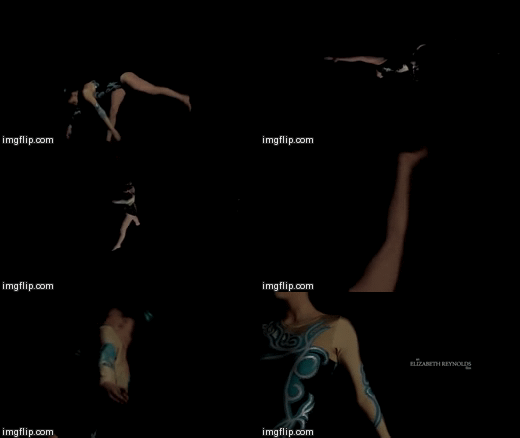
Due to the little time that we had in order to put everything together we dragged all the clips that we wanted to use onto the timeline, and then sorted those into difference sections to make the editing fast and efficient. We put ours into two main groups; warming up in the gym and then the shots in the dark. Once we had done that, we continued to break them down into each different element as we had about four different shots for each element. We then made a duplicate of the timeline so that we could edit on one and always had a back up in case something went wrong and we needed to revert to the original.
After we had done all this we started editing all the clips together, we didn't worry too much about the timing of it to start we just needed to put something together and put it into the order that we wanted to final film to be in. To start with our initial cut was around 5 minutes long so we needed to cut three minutes off of that but we had the shots in the order that we wanted so ti wouldn't take too long to cut it down.
We found that to start with our initial cut had too many shots of our actress warming up in the gym so we decided to cut about a minute and a half of that out, also with the help of Matt, he also helped us to cut the the entire thing to two minters, as by having an outsider look at it they could tell us what he thought wasn't necessary within the sequence.
After we had got the film down to two minutes we then began to add in titles, we decided to go with a minimalist font as to not distract what was going on in the sequence. We also decided to only start putting in the titles when the sequence goes into the black room because the white font would stand out more also because we decided that we wanted all the shots in the dark room to be in slow motion it gave us more time to place the titles in different areas on the screen and leave them for the necessary amount of time for the audience to be able to read them.


