Friday, 19 June 2015

'Marlow', 'Testcard' and 'Roja' Album Covers

'Marlow', 'Testcard; and 'Roja'

In class we were asked to look at different album covers and in groups discuss what we thought about them and come up with questions to ask a member of the band about the different designs that they have chosen to use and the progression of the band.

Marlow
'Marlow' was the first group that was put together and they came out with 3 albums and an EP.

'it's turning me on e.p.' 
  • This was the bands debut E.P.
  • The title of it had quite sexual connotations associated with it, the colour scheme also help to enhance this idea as red is usually associated with love and romance.
  • The white writing that is used stands out on the red background, due to the fact that this was their debut they needed to make sure that their name stood out and so therefore is memorable.
  • Questions we would ask:
  • Why did you put this girl on the over instead of the artist considering that it is their first album?
  • Why use the colour red?


'Darksparklecorner'
  • This was the band's debut album.
  • The name of the band has been written very small in the corner of the cover, the font remains the same as the first.
  • The young boy in the image looks scared and yet the word 'sparkle' has good connotations, doesn't sound like something to be scared of.
  • There is something creating a light which is lighting up the young boys face, whatever is creating that light is presumably what is scaring the young boy.
  • The wallpaper and duvet covers suggest that the image is from the late 1990's or early 2000's.
  • Questions
  • Why are there no spaces used in the album name?
  • Who is the child that was used?
  • What or who is he scared of?

'a day in july'
  • They have used the white font on the red background again as they did in their e.p.
  • They also have used the same font, which suggests that it is the font that they have decided to go with the band and they aren't likely to change it.
  • The image is a much happier one that in the album before, and again they have used an actual photo that has been taken instead of a drawn image.
  • Questions:
  • Who are the children?
  • Where was this taken?
  • What is the font that you use and why did you decide to use that one?
  • Do the changes in image reflect that change in the type of music on the album?


'deep breath fake air'
  • They have used white on red once again.
  • The artists name is a lot larger than in all of the previous album covers.
  • Seems like the image is quite an organic image, it is showing exactly where the music is coming from.
  • The image isn't too overly complicated.
  • Instead of using a photo again this time they have decided to use a drawing instead.
  • Questions:
  • What is the significance of the red on the white background?
  • Who drew the image?
  • Is it meant to be an outline of one of the members of the band?

Testcard:
After the band Marlow broke up a new band was created with new members called 'Testcard'

'Lines'
  • This was their debut album for the newly formed band.
  • The font is a lot different than the ones used in the previous album covers.
  • There is now a use of capital letters in the title.
  • Compared to the albums that they had previously it is very dull, notably the colours that are used.
  • Questions:
  • Is there a reason behind the much more simple image?
  • What type of music are they now creating?
  • Why is the album called lines and then there is a circle at the bottom of the image?

Roja
Again the band split up and a new band was created.

'Promises I Should Have Kept'
  • This was the debut album released by this band.
  • The album holds a very hispanic name.
  • The font is completely different then the two previous ones, quite a medieval look to it, not so block like.
  • The name of the band is a lot more prominent on the page.
  • The spanish looking lady gives the sense that it will be some sort of bull fighting sounding music that will be on the album, very different then what perhaps have been on the previous albums that have been produced.
  • Questions:
  • What type of music is on the album?
  • Who is the lady meant to be?
  • Why have such a drastic change this time?


WordPress vs. Wix

WordPress vs. Wix Website designing

Wordpress Review:
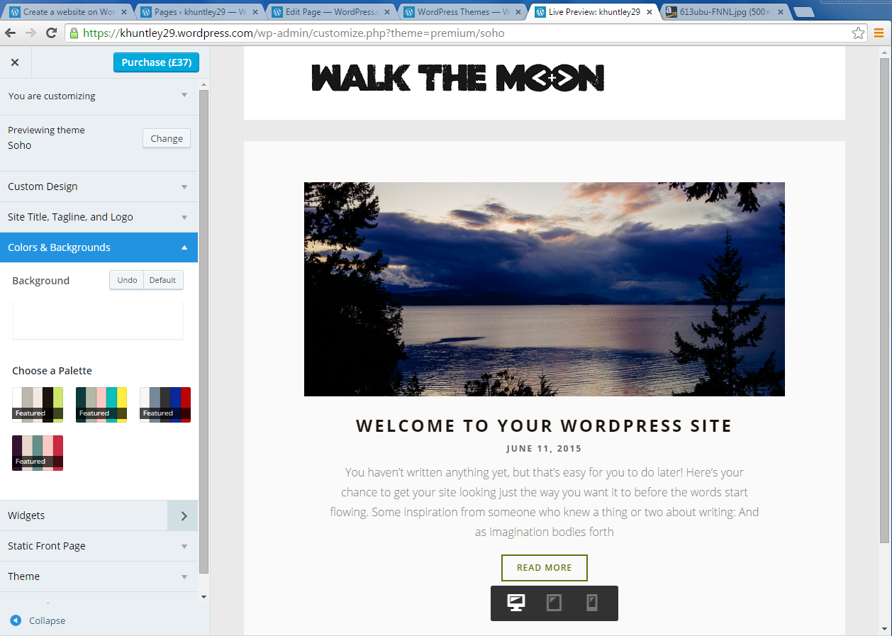
The set up and initially getting started with the program was quite complicated and when I left the website and went back onto it a few days later I found it difficult to find my saved work.


There were many different templates to choose from on the website so unfortunately, within the hour that we had to try and set up a home page I spent most of my time trying to chose which template I wanted to use.  The one downside to the software was that a lot of the templates had to be paid for and so there was quite a limited choice between the free ones. 

When trying to add images and text to the homepage a lot of error messages kept on coming up on the screen.  This may have been down to the fact that I had little experience with using the website so it was a case of trial and error, however, the software was rather hard to come to terms with and in the class I wasn't the only one who appeared to be struggling with it on the day. Images that I tried to add were continuously blurry and adding test to the page was a lot more complicated as you had to type what you wanted into the sidebar and couldn't just type it straight into the page.


After an hour, this is the homepage that I finally came up with.  There isn't much there as I found the software overly confusing and complicated.  Obviously if I decided to continue using it, over a certain amount of time I would come to grips with it, but for the hour we were given to try and work out how everything works I struggled to understand.

Wix Review

The Wix website was a lot easier to set up that Wordpress and the choice of templates was a lot more.  Furthermore, the templates were put into different categories and due to the fact I was making a website for a musician I just looked into the music category and found what I wanted.  The choices were also a lot more versatile and there were a lot more free ones available to use.

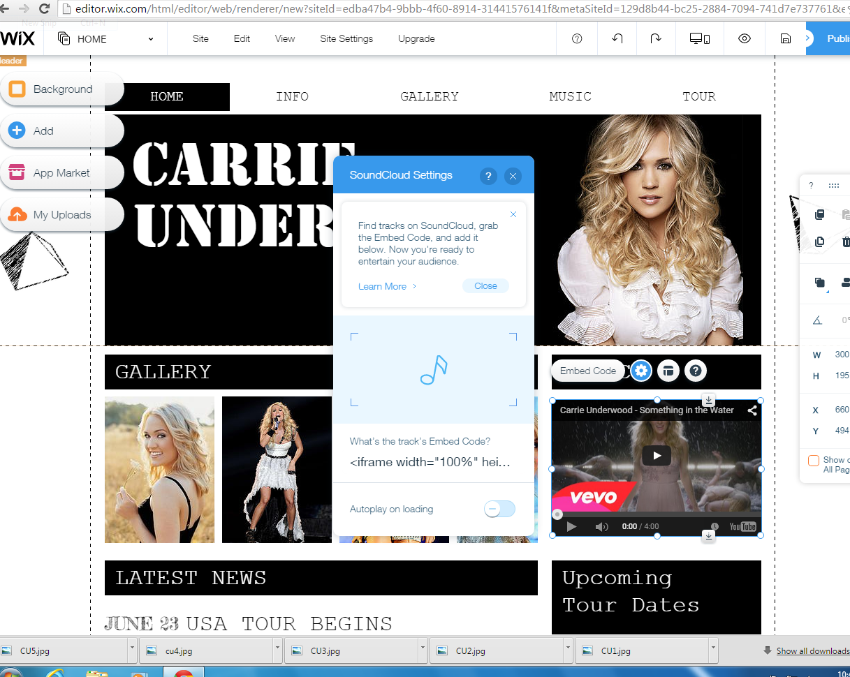
I decided to look into Carrie Underwood, who is a country singer.  The adding of images and text was a lot easier to do as you just had to click on the existing image/text and then press 'change image/text' and you could just add text straight away on the page without having to fine some other way around it.  Moving text and images around was also very simple as it was just a click and move format. 

I managed to pretty much create an entire homepage with the hour that we were given in class, including links to other websites to buy tickets for the concerts that I was advertising on the homepage.  I didn't really come across any problems when try to create those links as it was all very straight forward and basically took you step by step on adding them in, it was very hard to go wrong, even for me who isn't usually very good with learning how to use new websites.

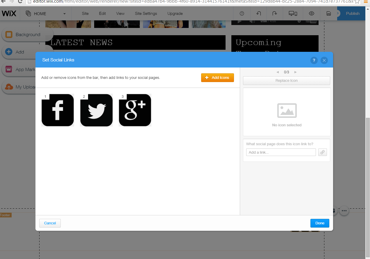
Creating links to Facebook, Twitter and google+ pages was very simple as you just had to click on the slogans at the bottom of the page and then this image popped up and you just had to add the html code in the small box and a link was automatically created.
As you can see I had a lot more screen grabs when using this website because I managed to do a lot more in the time that we were given.
Overall I would much rather use Wix when creating the websites for the bands that we will be doing as I found it a lot more straightforward and easy to use.  From the moment that I set up my account in Wix, to going back and continuing working on the website everything was easy to do and I came across hardly any problems in the creating of my homepage.


Tuesday, 16 June 2015

Introduction to Negus: Organic vs. Synthetic

Keith Negus
Organic vs. Synthetic

Negus identified two distinct ways of thinking about potential artists from within the music industry.  These two ideologies shape the way in which the artists' images and careers are developed, and the way that they are marketed towards different audiences.  The two ideologies are;
  1. The Organic Ideology of Creativity
Examples of artists who are know as organic artists include; Tom Odell, Ed Sheeran and James Bay.


  • Organic artists is a 'naturalistic' approach to artists. Their success are within the artists, who have o be 'nurtured' by the record company. 
  • Their image is 'enhanced' by the company, and they are given time to develop as their career progresses.


  1. The Synthetic Ideology of Creativity
Examples of artists known as synthetic artists include; Justin Bieber, Iggy Azalea and Nicki Minaj


  •  Synthetic is a combination of an approach to both the artists and their material.  Executives will attempt to construct successful acts out of the artists and the songs that they have at their disposal.  
  • The artists image is most likely constructed by the record company and the artist will be given a short time to prove their success or different combinations will take their place to be tried out by the record companies.


Dyer: Star Image Introduction

Richard Dyer: Star Image
 
Who is he and what does he say?
 
He has written extensively about the role of stars in film, TV and music.
He found that no matter what medium they are in, stars have different key feature all in common, these include;
  • A star is an image that has been constructed out of a range of materials (which include; videos, artwork and media appearances) and not actually a real person.
  • Stars are commodities which are produced and consumed on the strength of their meanings.
A star has to depend on all types of media- magazines, TV and radio- to try and make an image for themselves, which then can be taken and marketed towards their target audiences.
There are many common values of music stardom, including;
Youthfulness
Rebellion
Sexual magnetism
anti-authoritarian attitude
originality
Creativity/Talent
Aggression/Anger
Disregard for social values
Success against that odds
Dyer believes that the star image is incoherent, incomplete and 'open'. He says it is because it is based on two key paradoxes
  1. The star must be simultaneously ordinary and extraordinary for the consumer.
  2. The star must be simultaneously present and absent for the consumer.

. 


Friday, 12 June 2015

Madonna: Like a Prayer

'Like A Prayer' (1989)
'Like a Prayer' is a pop rock song recorded by the American singer, Madonna.  The soundtrack also contains elements of gospel music giving it a more spiritual feel. The music video, which was directed by Mary Lambert, created a lot of controversy at the time that it first came out, and remains a very controversial video to this day.  Images of crucifixes being set alright, the Ku Klux Klan and what seemed to be a black Jesus, made the video very unpopular with religious groups.
Three main reoccurring themes throughout the video are sex, race and religion.
The narrative of the video shows a white girl being murdered by a group of white supremacists, however a young black man gets framed although he was trying to help. Madonna hides in a church to try and find courage to go to court as a witness of the events.

Religion
As mentioned before, Madonna looks for guidance once entering the church as to what she should do, so it is no wonder that it is a reoccurring theme throughout the video. 


The video has some very quick shots of different religious iconography at the beginning, such as the crucifix, and along with her being inside a church, the audience is being given the idea that it will be a very religious video.  
Images of Stigmata are also used, the appearance of injures o the body that Jesus would have suffered, to show that Madonna is going through a religious experience in an extreme case.

The problems with religion begin to arise when in the video she is stood by burning crosses, which gives the connotation of the KKK. The violence that is connoted with a gang goes against what Catholics believed and that is why it was a risky decision to include that in the video.  Perhaps by doing it Madonna was trying to draw more awareness to the racism that was about at the time, and the video is her way of saying that it isn't right.


Race


The use of race within the video caused a stir amongst the population when they watched the video, notably with religious groups.  The saint that is used, Saint Thomas, was seen by many as being a 'black Jesus' and many devout Catholics thought that it wasn't right.  
The video subverts the normal stereotypes of a black man harming a young white woman, and a white man coming to her rescue.  In this case it is a white criminal and a black man comes to her aid, however racism is still involved in the video when the man gets caught and charged with the murder although he wasn't the one who committed it in the first place.
Futhermore, the idea of Madonna having a relationship with the black man in the video could have also caused quite a bit of controversy when it was first released as it wasn't common for a white girl and a black man to be together.

Gender + Star Image
The video shows the objectification of women when the young girl is harassed and killed by the group of young men.
Also Madonna gives herself a very sexual image throughout the video.  In one hand the audiences sees the religious aspect but on the other what Madonna is wearing totally goes against the Catholic idea of remaining pure and innocent until marriage.
We are given very sexual images, with many different close up on the tight dress that she is wearing and her chest area.

Other Images

The imagery of the roses and the dagger within the film portray romance, as they relate to the story of Romeo and Juliet.  
There is a dream like element to the video, Madonna falls from the sky and is caught by a a woman dressed in chorus robes.  This adds to the miracle element of the video, and the idea that Madonna is being 'saved' by the church spiritually and they put her back on course.
The use of the gospel choir at the end of the video, as Madonna explained herself, 'As the choir sings, she reaches an orgasmic crescendo of sexual fulfillment intertwined with her love of God. She knows that nothing's going to happen to her if she does what she believes is right. She wakes up, goes to the jail, tells the police the man is innocent, and he is freed. Then everybody takes a bow as if to say we all play a part in this little scenario."

The final scene ends with a curtain closing on all of the 'actors' within the video, including Madonna herself. The idea of this I believe would have been because Madonna knew that the whole video would have caused a lot of controversy that by turning it into a 'play' at the end she could pretend that it was all just to please the audience.  


Wednesday, 10 June 2015

Organic Album Covers

James Bay


By looking at this album cover there are different elements to it that make it stand out the artist stand out as being an 'organic' artist over a 'synthetic' one. 

  • The simple drawing in the centre of the album could be seen as reflecting the pureness of his music.
  • It could be seen as a way of suggesting that he wants people to appreciate his music more than the image he has.
  • The blue background portrays a sense of calm, and relates to the title as it could be seen as water.
  • The simplistic font shows that he is just being who he is and is staying true to himself.
  • Instead of using graphic designs and complex digital imagery, the choice of the painting in the background gives off an impression of the album being original- like his music.
  • Even though there is no picture of a face, it still appears he is looking down thoughtfully suggesting that his music will be quite deep.